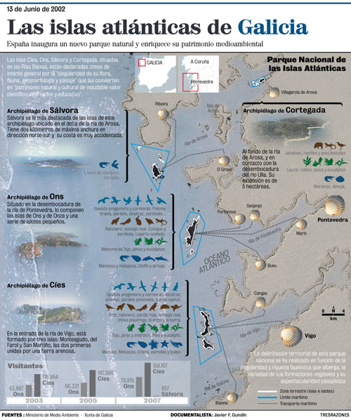
The Atlantic Islands of Galicia infographic involve going a little further from traditional maps to introduce the techniques of photographic editing in the same cartographic representation. Therefore, we take two photographs, one of the sand and one of the water, in order to describe with Photoshop, by simulating the drawing of a stick on the beach, the coastline relief. The space is divided in two parts: the sea and the land.
On the land, on the right side, several scallop shells, almost clearly, show the towns and cities from which the four archipelagos can be accessed. During the elaboration process, the islands, in black, simulated the seaweed dragged by the sea to the shore, but the information clarity took priority over other aesthetic aspects, and finally the archipelagos were emphasized with a white outline and surrounded by a blue line.
The sea, on the left side, contains nearly all the data and includes photographs of the archipelagos, apparently sunken under the transparent water sheet.
In terms of information, the representation of the flora and the fauna of the new natural park is brought out. All the species of the area are outlined, not so much to be recognised by the reader as to represent the natural riches of the area. This impression is stressed by the fact that animals and plants are attached to a colour code that matches the following categories: light blue for aquatic birds, dark blue for shellfish and molluscs, brown for the land fauna and green for the flora.
The innovative creation of the graph by using images is contrasted against the use of traditional infographic tools, such as the simple localisers located in the top part of the graph, the itineraries in discontinuous line of the routes, the orthodoxy of the graphic scale or the use of classical keys.
